 Designing better notifications for iOS — and more UX links this weekYour weekly collection of UX links, brought to you by your friends at the UX Collective.If you like the links, don't forget to 👏👏👏👏👏👏👏👏👏👏👏👏👏👏
Designing a better notification experience for iOS →As a huge tech fan and someone that works in the industry, I own of a lot of gadgets, especially smartphones. However, my daily driver is an iPhone X simply because iOS is by far my favorite operating system to use. It works seamlessly with my Mac and iPad, it receives frequent software updates and the quality of apps in the store is just great. I really like the ecosystem, but there are some areas it could definitely improve on. This article is about exploring some of the opportunities around the current notification system to make it even better. — By Sandor Gyuris.
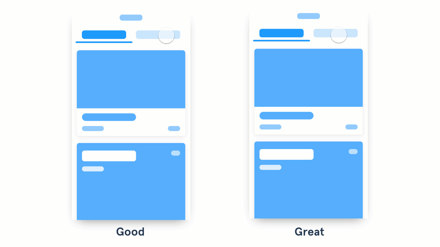
Good to great UI animation tips →Let's see some examples of UI animations going from good to great. With a little bit of tweaking here and there, you can elevate your UI patterns with animation. The interactions listed show continuity between states, denote a relationship between shared elements, and call the user's attention to something they should notice and act upon.—By Pablo Stanley. The atomic unit of a research insight doc? →A report is not the atomic unit of a research insight. An observation is. By WeWork UX. Really bad design exercises →Why do we put each other through design exercises — and how do fix their problems? By Matthew Ström. What happens when data scientists and designers work together →A project between IDEO and Rise focused on making data-driven charts easier to read by athletes. The principle of commitment and behavioral consistency →When the new year comes, people decide they are going to be healthier, richer, wiser by starting some new, positive habit. This phase rarely lasts, though. International Women's DayFor us at the UX Collective, it's pretty simple: when you have someone in a leadership position at your company that really represents you — your gender, cultural background, skin color, beliefs, you name it — , you feel more motivated to move forward (and up) in your career. For this year's International Women's Day, Paula Macedo and I decided to interview some of the most well-known and respected female leaders in UX and HCI, to understand how they have dealt with gender balance (and sometimes inequality) over the course of their careers. Learning from other professionals' experiences and paths can hopefully inspire a younger generation of designers starting in User Experience just now.
https://medium.com/media/05d5fd32eda31cbd1b83287606744532/href From the communityAn exploration of visual indicators in real life →Digital visual indicators are used to make certain elements stand out from the crowd. But how about visual indicators that exist in the physical world? By Joe Caron. Stop blaming your digital tools for your problems →Your tools are not the problem, your reliance and attitude towards them is. By James Whitman. Sketch's new update is too little too late →Sketch 49 comes with some basic prototyping features — but if you take a closer look it starts to fall apart. By Alborz Heydaryan. What the hell is going on with the UX in cryptocurrency? →Everything is confusing. Are the Crypto experts making everything confusing on purpose? By Flavio Lamenza. In defense of minimal (digital) design →Overcomplicating things is not doing you any favors. That seems to evade, at all costs, the primary goal of the design itself — to clearly communicate something. By Andrei Korchagin. News & ideasThe challenge of designing and formatting messages in Slack Alexa's creepy laughs were a big deal this week Uber's machine learning platform has a name: Michelangelo User friendly ways to handle account deletion You Think You Know Me is a card game to break the ice with friends, family and coworkers Two photographers unknowingly shot the same millisecond in time A dozen times AI startled, surprised and scared the world A poster paying homage to the founding father of cryptocurrencies and his groundbreaking whitepaper Here's how designers can empower users to fight fake news Uber self-driving trucks are now moving cargo for Uber Freight customers Rotten Tomatoes is being rebranded for the first time in 17 years A portfolio that looks like a Finder folder — why not? Tools & resourcesDropbox and Google announce new cloud integration features Overflow: turn your designs into playable user flow diagrams Motus is a gallery of coded motions and animations Zenify is a mindfulness bot that sends you short meditative assignments throughout the day Figma Dark UI: a sleek revamp of the UI for low-light environments Splish.io: make images move or make videos still URLColors: this extension adds a colored border to your site to differentiate dev, test, and production environments Sketch 49 lets you find and replace colors everywhere Coördinator: turn SVGs into X and Y coordinates A year ago…Design better cards →Cards present various content pieces in a group. The viewer attains a quick overview of information and has the option to see its entirety. The information between cards is of equal hierarchy. This allows the user to browse content in a manner similar to surveying a store shelf. Users evaluate each card before committing to action. — By Andrew Coyle. Like the links? Clap below 👏👏👏 |

 |
No comments:
Post a Comment